
Momentum Trumps Sentiment
Thoughts on the Market

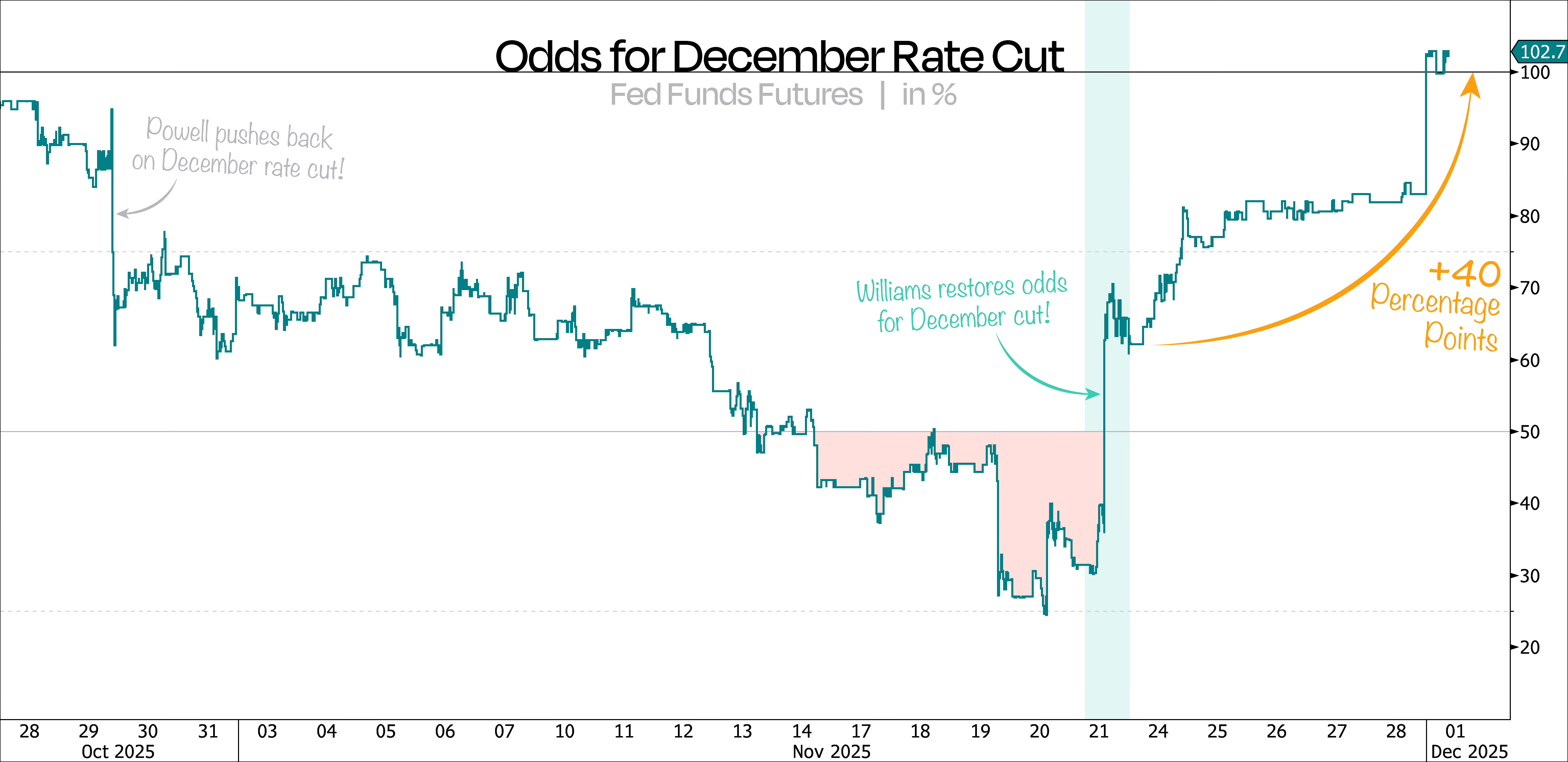
It took 11 days to erase the odds of a December rate cut — and just one day to bring them back to life.
Just as we expected, Fed officials fully dialed back their hawkish tone last week, pushing the odds of a December cut up by another 40 percentage points.
As our first chart shows, those odds now sit at 102% — more than four times what they were just days ago, and all without any meaningful new data. That doesn’t exactly reflect well on the Fed’s communication strategy.
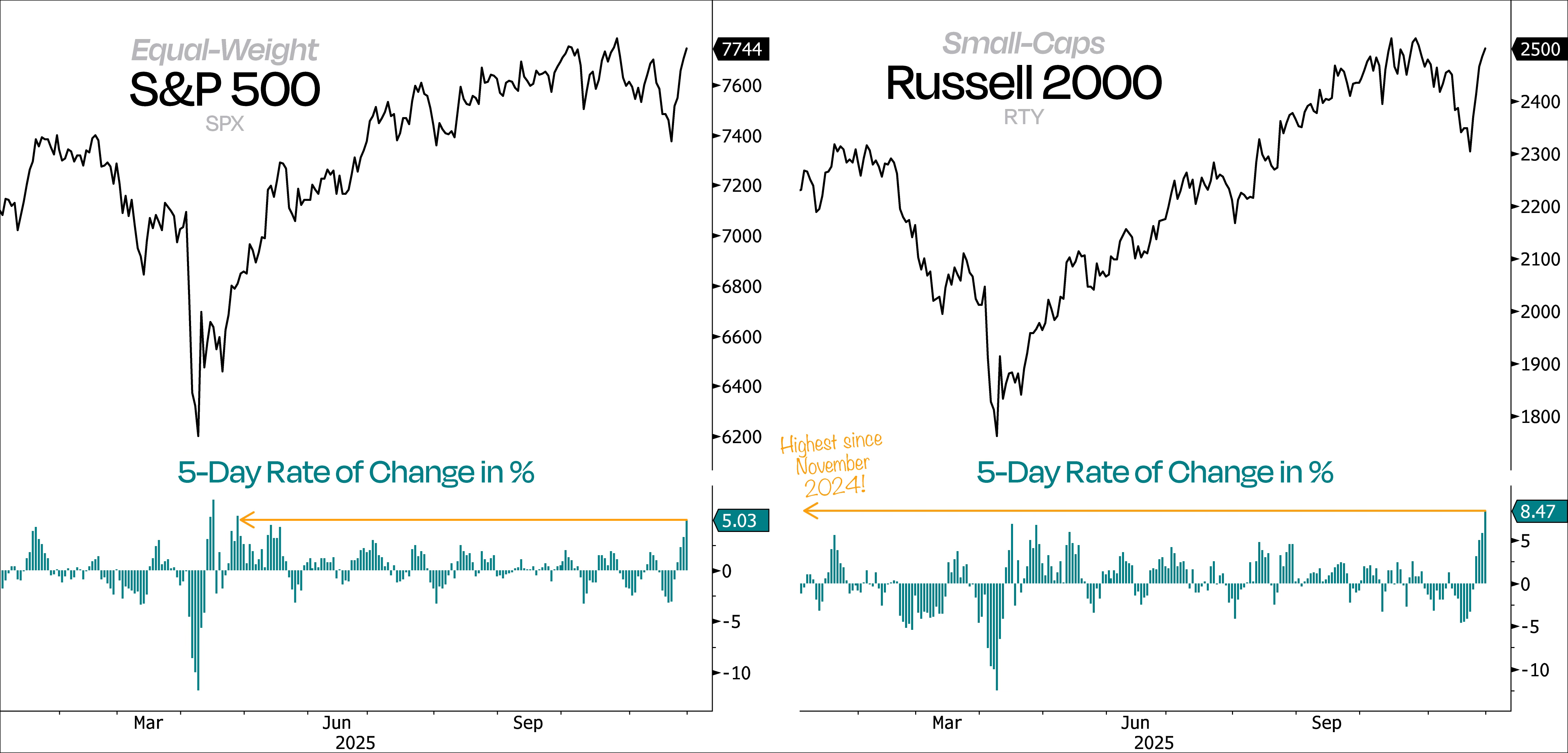
Like we said last time, this whole pullback has been Fed-driven, so a dovish pivot was always likely to send risk assets sharply higher again.
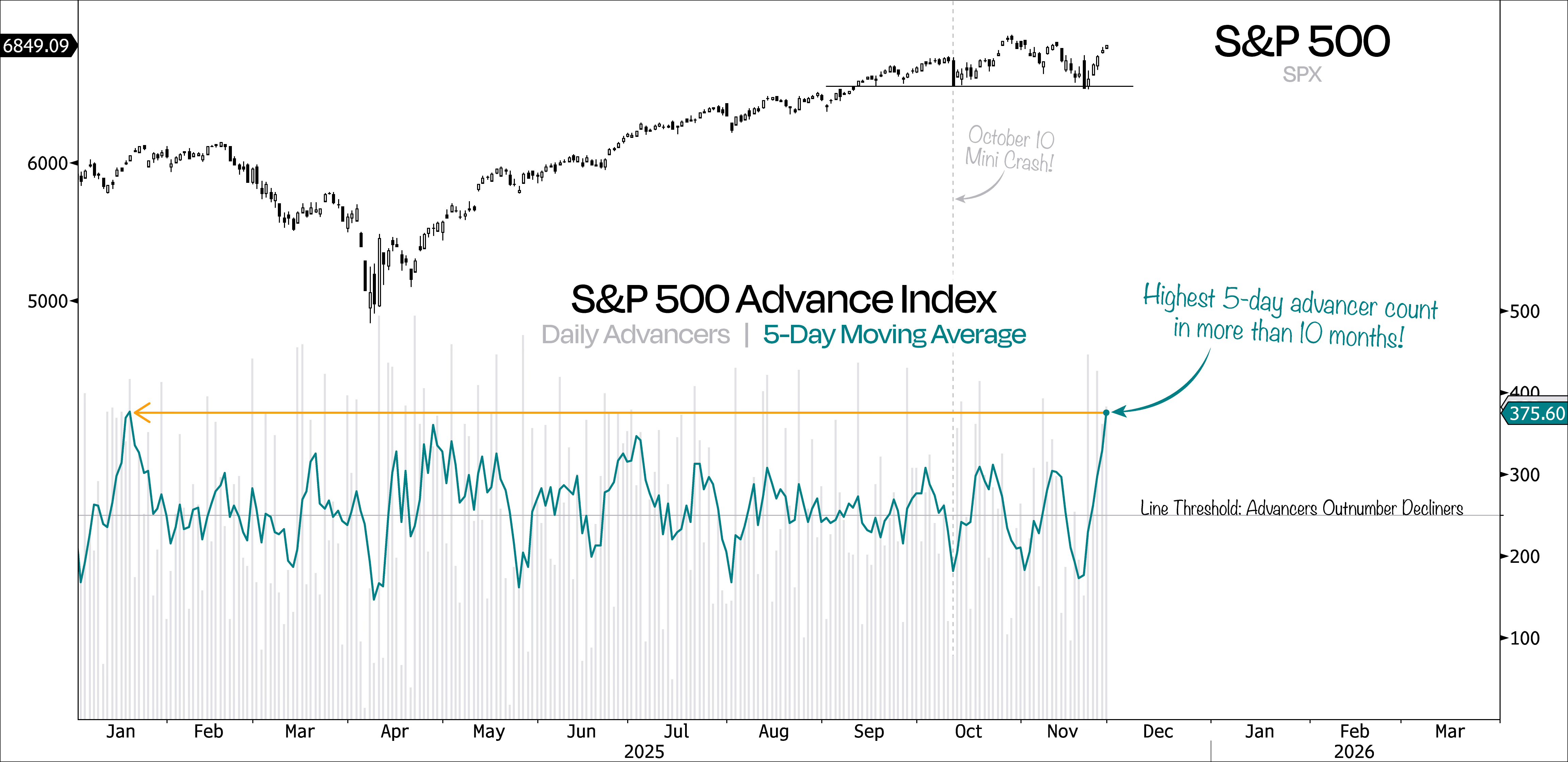
Not only did it happen, but it’s happening so broadly and on such heavy volume that this isn’t just an oversold bounce — it’s a genuine buying thrust. The best way to show this is by checking the 5-day rate of change in the equal-weight S&P 500 and the Russell 2000.
What we know is that big moves usually kick off with big moves, so the fact that we just witnessed the strongest 5-day win streak since April isn’t just a good sign — it’s a pretty loud “things are turning” signal.
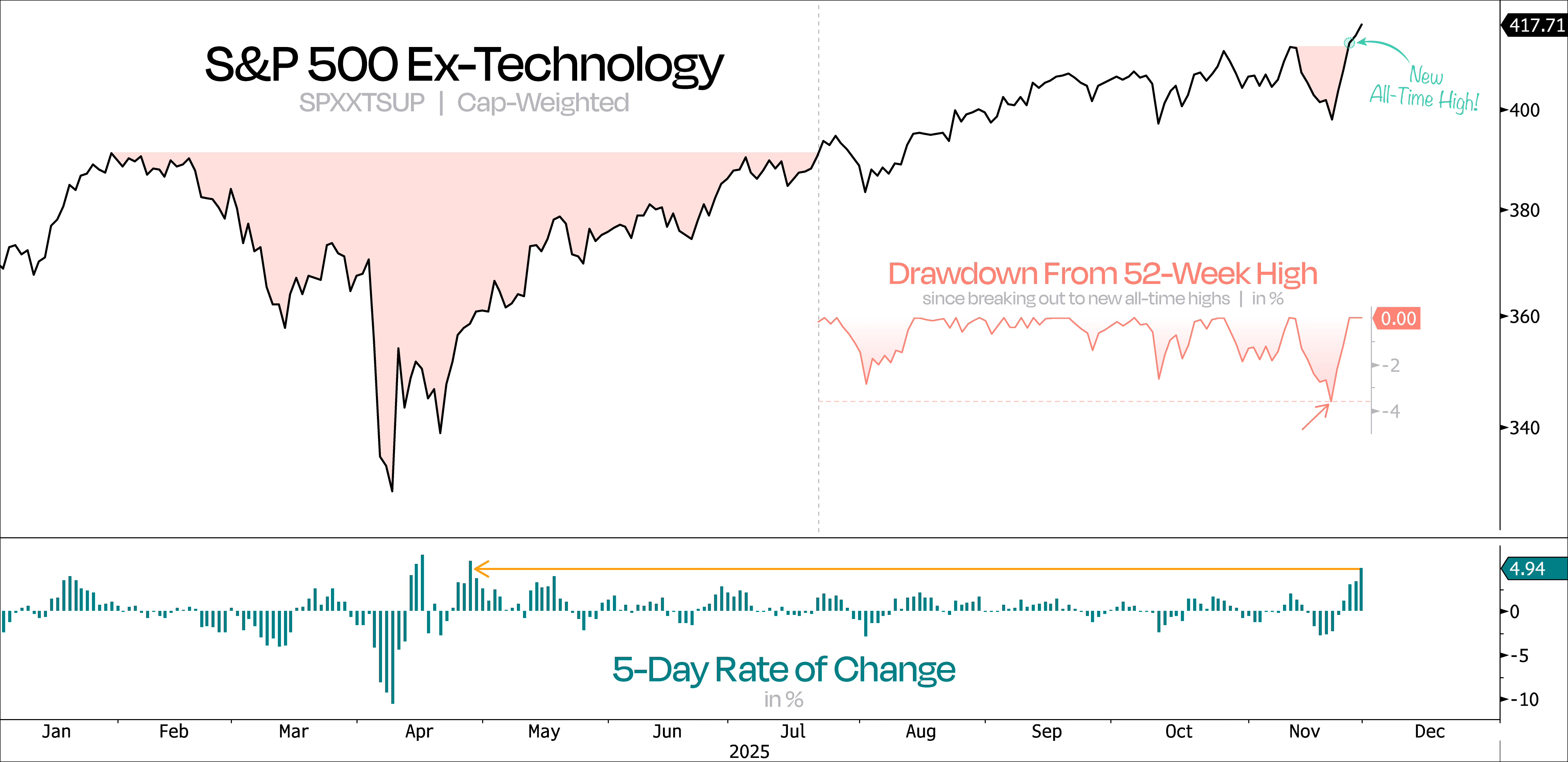
What’s really encouraging is seeing demand spike right at a key level — at exactly the right time. On top of that, the broader S&P 500 just proved it can keep climbing even with Nvidia down.
As our next chart shows, excluding the Technology sector, the broader market looked ready to roll over. But thanks to recent developments, the S&P 500 Ex-Tech Index hit new all-time highs — just three days after experiencing its deepest pullback since its July breakout.
Meanwhile, Technology is still over 6% away from its own new highs.
That’s the textbook definition of a Shake ’n Bake reversal — the bears think they’ve got it, only to get slammed back by momentum. Weak hands get shaken out, and then the market bakes in the big follow-through.
That’s exactly what we’ve seen in a number of real-economy stocks that recently looked like they were about to get flushed — not exactly what you want to see in a bull market.
Take Regional Banks and Retailers, for example. They dipped below their anchored VWAPs from the April lows, only to catch massive momentum and swing back above their anchored VWAPs from the September highs.
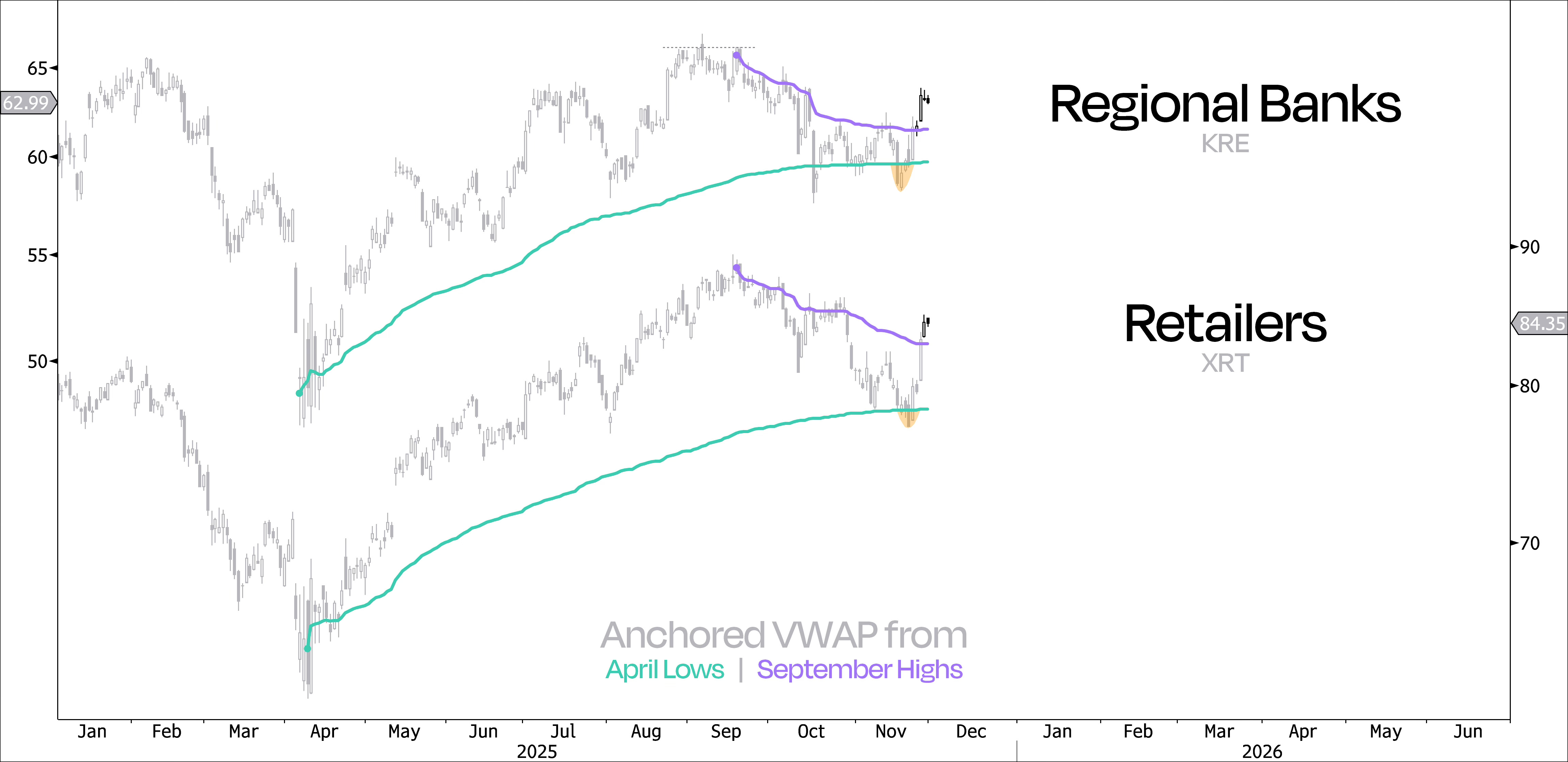
We’re seeing the same thing across a bunch of other groups too — Homebuilders, equal-weighted Discretionary and Industrials, and small-caps in general. That’s a good sign for this rebound, especially since most of these sectors have been lagging all year.
The good news is participation is widening, and leadership has been exactly what you want since that ugly Nvidia reversal day. If this bull market is going to broaden, now’s the time.
What could really confirm and seal it this week is the strong chance of a Zweig Breadth Thrust or even a deGraaf Breadth Thrust kicking in. Even though they measure breadth in a very different way, the message is basically the same — this market is going from nobody’s buying to everybody’s buying in a really short amount of time.
More importantly, the historical record following such breadth thrusts speaks for itself — especially when both occur within a month of each other. On average, the S&P 500 has jumped +26% over the next year — higher every time. The last time it happened was May 12, and we’re already up +17% since then.
Bottom line: when these thrusts show up, they matter, because they’re reliable, powerful, and definitely something you want in your toolkit.
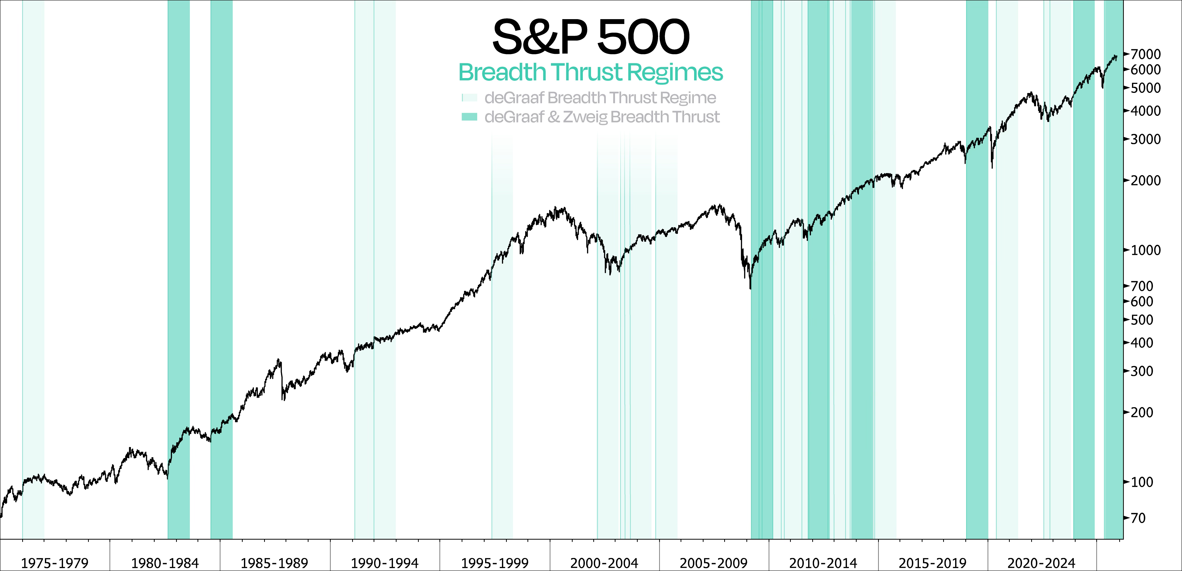
As we can see, all of this points to a way stronger, more sustainable bounce off the October lows — much stronger than our first attempt to turn higher following the 10/10 mini-crash.
Back then, the S&P’s rally quickly fizzled due to weak participation. This time, though, we’re seeing the most stocks rising over a 5-day stretch in more than a year — just days after that same rolling average hit its lowest level in nearly four months.
The last time we got a snapback this powerful was in November 2023, when the S&P 500 ripped higher off its lows after a 10% correction. And perhaps more importantly, a Zweig Breadth Thrust followed shortly after.
So, while breadth is making a comeback, we acknowledge that market participation had deteriorated in the months leading up to this rally. That got a lot of attention — and for good reason — but it’s also important to look at breadth over a longer timeframe.
Traditional measures, like the percentage of stocks trading above their 200-DMA or the number of stocks hitting new 52-week highs, are really just point-in-time analysis. A sharp, aggressive selloff can weaken both measures almost instantly, which is why they often fail to capture a more representative view of longer-term participation.
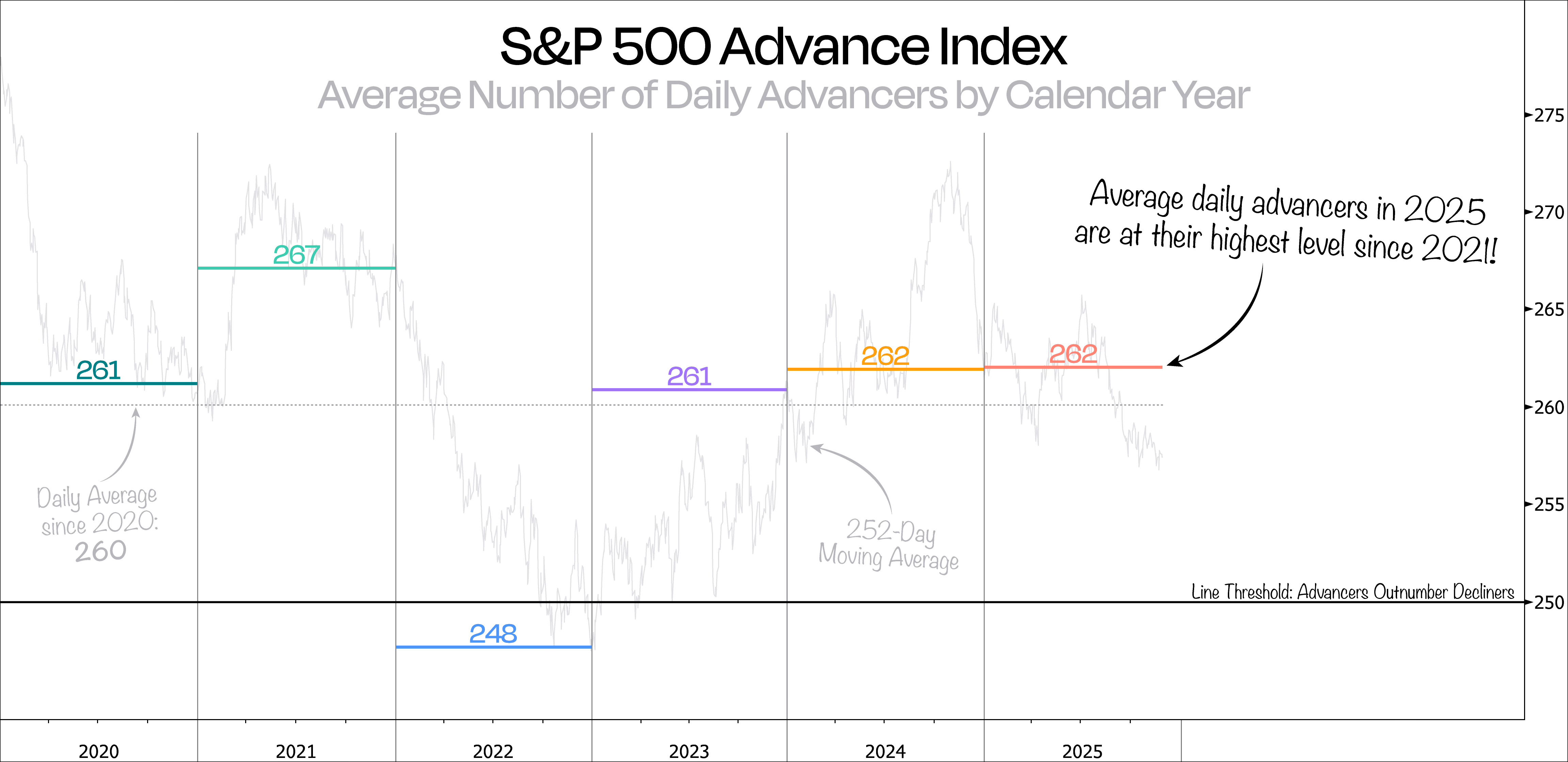
A better way to track longer-term participation is by looking at the average number of daily advancers on a calendar-year basis, or through a rolling 252-day average.
By that measure, 2025 is looking strong — the average daily advancers are at their highest since 2021. In other words, market participation during this bull market hasn’t been as strong as it is this year.
It’s also worth noting how much lower the rolling 1-year average (252 days) remains compared with this year’s average. The reason is simple: the 252-DMA still includes December of last year, which saw an extremely weak average of just 204 daily advancers.
Now, when we zoom out even further, things get really interesting.
In the next chart, we show the entire data for the S&P 500 Advance Index, this time broken down into 5-year average periods. Contrary to what a lot of people think, the rolling 252-day line actually shows that market participation has generally gotten stronger over time — not weaker, even with the rise of the mega-caps.
Moreover, besides the fact that 2025 stands out with one of the highest levels of average daily advancers in the last 30 years, we can also see how extremely narrow market participation was in the days leading up to the peak of the Dotcom bubble. In fact, one of the worst 1-year periods was right around the top in March 2000, when the bubble finally burst.
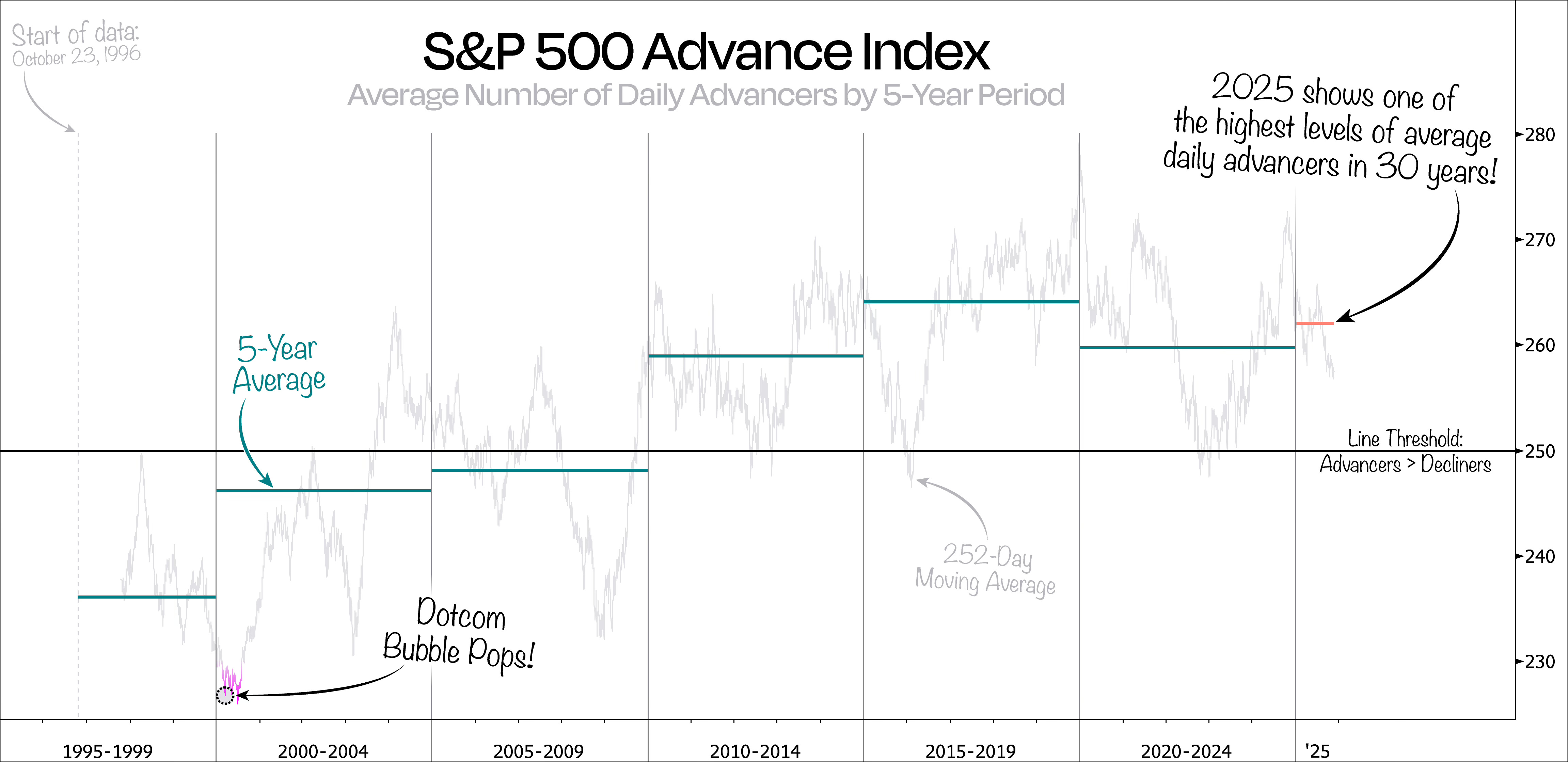
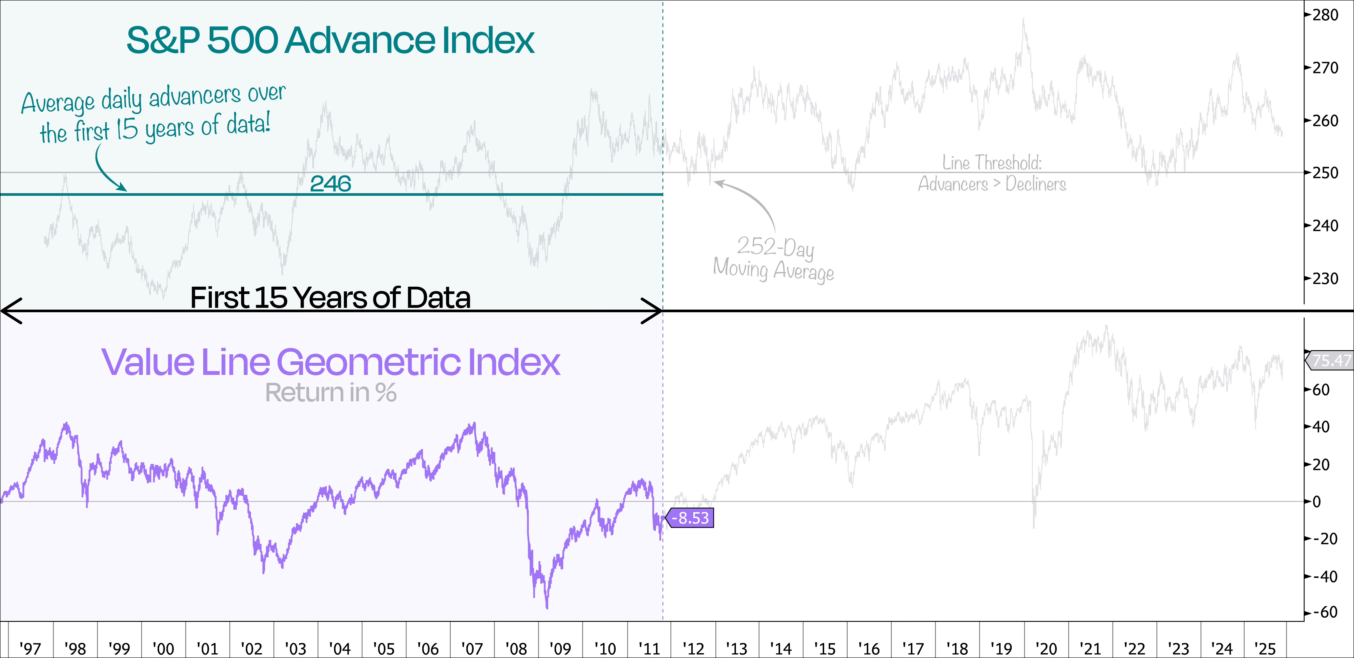
While the data set covers nearly 30 years, we can’t help but notice that the first half largely stayed below the threshold line of 250, where advancers begin to outnumber decliners.
Indeed, when we plot the average daily advancers over those first 15 years, the S&P 500 averaged just under 246 advancers per day — meaning that, on average, more stocks were falling than rising each day.
That also matches up with the Value Line Geometric Index, which tracks the average performance of the typical stock. Over that same timeframe, the average stock in the index lost about -8.5% over that period, even as the S&P 500 as a whole gained 75%.
So where does that leave us?
It’s fair to say that today’s market looks quite different.
Sure, every now and then, a handful of mega-cap stocks steal the show — and with their size, that’s almost unavoidable. But what sets the current market apart is that today, a lot more stocks are actually participating in the market’s rise.
That said, wider participation shouldn’t be confused with evenly distributed contribution. Big companies will continue to dominate index returns, but the fact that more stocks are moving is a sign of a healthy market.
The takeaway: Broad participation = healthy market. Concentrated returns = index mechanics at work.
Keep reading with a 7-day free trial
Subscribe to Duality Research to keep reading this post and get 7 days of free access to the full post archives.